Saturday, March 29, 2014

CT Tutorial for Spring Darkness

**This tutorial was written using Photoshop CC. I believe the instructions should work with various other versions, but they are not tested on any other version.  This tutorial is my own creation.  Any similarity to any other tutorial is not done purposely or knowingly (aside from the fact that the process is pretty similar in most tutorials).  If you do not know how to do some of the things I mention here (like mirroring an image, adding a drop shadow, resizing elements, etc.), check out my “Tips and Tricks” tutorial. **

Supplies:
Kit- “Dark Spring” by Bookworm Dezines which can be purchased from PicsForDesign, Scrap Candy, or Inspirations of Scraps Friends.

Tube – “Liza” by Designs by Norella available for purchase at PicsForDesign.

Abbreviations:
DS – Drop Shadow

Settings I use:
DS Settings - Blend Mode set to Multiply, Opacity set to 75%, Angle set to 120 degrees, Distance 5, Spread 0, Size 5

Ready…..Set….Tag!
Open a new canvas (Ctrl +N) 700 x 700, transparent background.  This will be referred to as the working canvas in my directions when switching between canvases.

Add Element 39  to the canvas and resize it to fit the center of the canvas.  Add DS.

Add your tube to the working canvas.  Resize her so she fits in the upper right corner of the canvas slightly overlapping the frame. Add DS.

Add Element 83 to the canvas in layer behind the frame.  Resize it so that it fills the center of the frame.

To add the background I added a new layer to the bottom of the layers and used multiple cloud brushes and various shades of blue and purple to paint clouds against the background.

On top of the painted background I added the scattered elements from the kit.  For each one I added a layer at the top and then a layer at the bottom diagonally.  Here is the layout:
  • Element 17 – Bottom left corner and duplicated to top right corner
  • Element 10 – Upper left corner and duplicated to top right corner
  • Element 2 – Upper middle and duplicated to lower middle
  • Element 79 – Upper middle and duplicated to lower middle

Voila!  The focal point of your tag is now created.

Now decorate your tag with any of the spring themed elements from the kit.  Resize the elements as you add them so fit the proportions of your tag.  Experiment with rotating them and mirroring them for more variety.  In addition duplicate elements and use multiple times to fill in holes and add more pizzazz.  In this tutorial to indicate when I used more than one of the same element I will add (X#) by the name to indicate how many versions of the element I used. 

Here are all the elements I used from the bottom layers up.
  • Element 13
  • Element 1 (x2)
  • Element 84 (x2)
  • Element 86
  • Element 81 (x2)
  • Element 61 (x2)
  • Element 49
  • Element 48
  • Element 75
  • Element 24
  • Element 89

Add your license and copyright info to the tag.

Add name and any other text of choice.

Save as PNG and go share with all your friends!


Thank you for trying my tut! I’d love to see how your tags turn out so if you like what you made, please post a copy here or show me on Facebook!

Friday, March 28, 2014

CT Tutorial for Carrie


**This tutorial was written using Photoshop CC. I believe the instructions should work with various other versions, but they are not tested on any other version.  This tutorial is my own creation.  Any similarity to any other tutorial is not done purposely or knowingly (aside from the fact that the process is pretty similar in most tutorials).  If you do not know how to do some of the things I mention here (like mirroring an image, adding a drop shadow, resizing elements, etc.), check out my “Tips and Tricks” tutorial. **

Supplies:
Kit- “Amy Lee Matching Kit For SkyScraps” by Tiny Turtle Designs.  Available at her store “Tiny Turtle Designs”.

Tube - Carrie by Designs By Norella.  You can purchase the tube exclusively at PicsForDesign.com.

Abbreviations:
DS – Drop Shadow

Settings I use:
DS Settings - Blend Mode set to Multiply, Opacity set to 75%, Angle set to 120 degrees, Distance 5, Spread 0, Size 5

Ready…..Set….Tag!
Open up the PSD file for the template.  This will be referred to as the working canvas in my directions when switching between canvases.

Add your poser to the canvas.  Resize her so she fits on the right side of the canvas. Add DS.

Add Paper 11 and resize to the fit the canvas.  Make sure this becomes your bottom layer.  It will stay the bottom layer of the tag.

Create the center piece over the background of the canvas with the following elements.  Stagger them to look as though the jewels are scattered on the ground and falling from the sky against the rose overlay:
  • Element 46
  • Element 47
  • Element 41
  • Element 54
  • Element 50
  • Element 48

Add Element 14 and resize to your liking so it is slightly behind the poser.  Add DS.

Switch to the Poser psd canvas. Use the Rectangular Marquee Tool to draw a box around the top half of the poser in the psd file.  Copy (Ctrl + C) the selection and return to your working canvas.

On your working canvas paste (Ctrl + V) the copied selection.  Resize to fit the bottom left of the canvas and position as you like.

Voila!  The focal point of your tag is now created.

Now decorate your tag with any of the glamorous elements from the kit.  Resize the elements as you add them so fit the proportions of your tag.  Experiment with rotating them and mirroring them for more variety.  In addition duplicate elements and use multiple times to fill in holes and add more pizzazz.  In this tutorial to indicate when I used more than one of the same element I will add (X#) by the name to indicate how many versions of the element I used. 

Here are all the elements I used from the bottom layers up.
  • Element 110
  • Element 106
  • Element 104
  • Element 103
  • Element 111
  • Element 98
  • Element 96
  • Element 94

Add your license and copyright info to the tag.

Add name and any other text of choice.

Save as PNG and go share with all your friends!

Thank you for trying my tut! I’d love to see how your tags turn out so if you like what you made, please post a copy here or show me on Facebook!

Tuesday, March 25, 2014

2 More Spring Facebook covers


Two new spring Facebook covers featuring the scrap kits of Bookworm Dezines!

Monday, March 24, 2014

CT Tutorial for Vintage Beauty


**This tutorial was written using Photoshop CC. I believe the instructions should work with various other versions, but they are not tested on any other version.  This tutorial is my own creation.  Any similarity to any other tutorial is not done purposely or knowingly (aside from the fact that the process is pretty similar in most tutorials).  If you do not know how to do some of the things I mention here (like mirroring an image, adding a drop shadow, resizing elements, etc.), check out my “Tips and Tricks” tutorial. **

Supplies:
Kit- “Vintage Beauty” by Bookworm Dezines which can be purchased from PicsForDesign, Scrap Candy, or Inspirations of Scraps Friends.

Tube – “Cool Retro” by Ismael Rac available for purchase at XeracX.

Abbreviations:
DS – Drop Shadow

Settings I use:
DS Settings - Blend Mode set to Multiply, Opacity set to 75%, Angle set to 120 degrees, Distance 5, Spread 0, Size 5

Ready…..Set….Tag!
Open a new canvas (Ctrl +N) 700 x 700, transparent background.  This will be referred to as the working canvas in my directions when switching between canvases.

Add Paper7 to the canvas.  Resize to fit the entire canvas.

Add Element7 to the canvas and resize it to fit the width of the canvas.  Position toward the bottom of the canvas.  Add DS.

Add layer 4 of your tube to the working canvas.  Resize her so she fits the bench and position her so she looks as though she is resting on the bench. Add DS.

Add grass to a new layer at the bottom.  To do this use a grass brush set and multiple shades of green.  To add some depth add a new layer above the brushed grass and use the paint tool to fill the layer with a grass pattern.  Next apply the grass pattern layer as a clipping mask to the brush strokes.  You can add multiple layers of the grass and clipped patterns until you get the effect you want.

To add the clouds I added another new layer on top of the Paper7 layer and used multiple cloud brushes and various shades of blue and white to paint clouds against the background.

Voila!  The focal point of your tag is now created.

Now decorate your tag with any of the vintage inspired themed elements from the kit.  Resize the elements as you add them so fit the proportions of your tag.  Experiment with rotating them and mirroring them for more variety.  In addition duplicate elements and use multiple times to fill in holes and add more pizzazz.  In this tutorial to indicate when I used more than one of the same element I will add (X#) by the name to indicate how many versions of the element I used. 

Here are all the elements I used from the bottom layers up.
  • Element11
  • Element16
  • Element55
  • Element34
  • Element19 (x2)
  • Element17
  • Element15
  • Element12
  • Element2
  • Element51
  • Element48
  • Element58 (x2)
  • Element36

Add a new layer.  Use the rectangular marquee tool to select the entire canvas and from the menu bar Select > Modify > Border.  Set the width to 10 and apply a complimentary style to the layer.  Use the Paint bucket tool to fill the border.

Add your license and copyright info to the tag.

Add name and any other text of choice.

Save as PNG and go share with all your friends!


Thank you for trying my tut! I’d love to see how your tags turn out so if you like what you made, please post a copy here or show me on Facebook!

Sunday, March 23, 2014

CT Tutorial Betty


**This tutorial was written using Photoshop CC. I believe the instructions should work with various other versions, but they are not tested on any other version.  This tutorial is my own creation.  Any similarity to any other tutorial is not done purposely or knowingly (aside from the fact that the process is pretty similar in most tutorials).  If you do not know how to do some of the things I mention here (like mirroring an image, adding a drop shadow, resizing elements, etc.), check out my “Tips and Tricks” tutorial. **

Supplies:
Kit- “Safari Nights” by Designs by Stina.  The kit used for this tutorial is “Safari Nights” by Designs by Stina.  Visit her blog “Staffy Scraps” to see which stores you can purchase her kits at currently

Tube - Betty by Designs By Norella.  You can purchase the tube exclusively at PicsForDesign.com.

Abbreviations:
DS – Drop Shadow

Settings I use:
DS Settings - Blend Mode set to Multiply, Opacity set to 75%, Angle set to 120 degrees, Distance 5, Spread 0, Size 5

Ready…..Set….Tag!
Open up the PSD file for the template.  This will be referred to as the working canvas in my directions when switching between canvases.

Add the Jeep element from the kit to the canvas.  Resize and place in the center of the canvas.  Add DS.

Add your poser to the canvas.  Resize her so she fits on the canvas and is positioned to look as though she is standing in front of the jeep on the right side of the canvas. Add DS.

Add multiple copies of the Sand element to the bottom of the tag.  I used 4 in total and layered them so that I created a sandy floor under the Jeep and poser.

Add a new layer at the bottom and make a sky background. I used a background cloud brush to paint the background in a sky blue color.

Switch to the Poser psd canvas. Use the Rectangular Marquee Tool to draw a box around the head of the poser in the psd file.  Copy (Ctrl + C) the selection and return to your working canvas.

On your working canvas make sure the background layer is selected then paste (Ctrl + V) the copied selection.  Transpose the selection horizontally. Resize the selection so that poser’s head fits to your satisfaction in the top left of the canvas.  To give it the transparent look that mine has, apply the Blend Mode of Luminosity in the Blending Options. 

Add Leopard01 from the kit and resize to fit in the right corner.  I applied the same Blend Mode (Luminosity) to the Leopard01 element to match the face in the sky.

Voila!  The focal point of your tag is now created.

Now decorate your tag with any of the safari elements from the kit.  Resize the elements as you add them so fit the proportions of your tag.  Experiment with rotating them and mirroring them for more variety.  In addition duplicate elements and use multiple times to fill in holes and add more pizzazz.  In this tutorial to indicate when I used more than one of the same element I will add (X#) by the name to indicate how many versions of the element I used. 

Here are all the elements I used from the bottom layers up.
  •  Grass01
  • Grass03
  • Grass02
  • Medi_genie2
  • Leopard03
  • Monkey

Add your license and copyright info to the tag.

Add name and any other text of choice.

Save as PNG and go share with all your friends!


Thank you for trying my tut! I’d love to see how your tags turn out so if you like what you made, please post a copy here or show me on Facebook!

Saturday, March 22, 2014

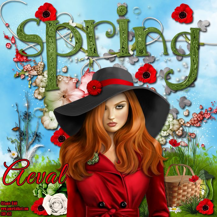
CT Tutorial for Joy


**This tutorial was written using Photoshop CC. I believe the instructions should work with various other versions, but they are not tested on any other version.  This tutorial is my own creation.  Any similarity to any other tutorial is not done purposely or knowingly (aside from the fact that the process is pretty similar in most tutorials).  If you do not know how to do some of the things I mention here (like mirroring an image, adding a drop shadow, resizing elements, etc.), check out my “Tips and Tricks” tutorial. **

Supplies:
Kit- “Joy” by Bookworm Dezines which can be purchased from PicsForDesign, Scrap Candy, or Inspirations of Scraps Friends.

Tube – Jamie Kidd Individual Tube 52-3 (Red Alert) by Jamie Kidd available for purchase at Creative Design Outlet.

Abbreviations:
DS – Drop Shadow

Settings I use:
DS Settings - Blend Mode set to Multiply, Opacity set to 75%, Angle set to 120 degrees, Distance 5, Spread 0, Size 5

Ready…..Set….Tag!
Open a new canvas (Ctrl +N) 700 x 700, transparent background.  This will be referred to as the working canvas in my directions when switching between canvases.

Add layer 2 of your tube to the bottom of the canvas.  Resize her so she fits in the middle of your canvas. Add DS.

Add Element52 to the top of the canvas and resize. Add DS.

Add Element29 to the bottom of the canvas in a layer behind the tube and position as you like.  Add another copy of Element29 to the bottom so that the grass fills out the entire bottom of the canvas.

Add Element34 and resize so that it fits the entire canvas.  Position between the Spring wordart and the grass.  Make sure it is below the other layers.  Add DS.

Add Element39 to the canvas in a layer behind the wordart and resize to fit the entire canvas.

To fill the background of the rest of the canvas I added a new layer to the bottom.  I then select the Paint Bucket tool and chose to switch the fill method from Foreground to Pattern.  I then selected a cloud pattern and filled the canvas.

Voila!  The focal point of your tag is now created.

Now decorate your tag with any of the spring themed elements from the kit.  Resize the elements as you add them so fit the proportions of your tag.  Experiment with rotating them and mirroring them for more variety.  In addition duplicate elements and use multiple times to fill in holes and add more pizzazz.  In this tutorial to indicate when I used more than one of the same element I will add (X#) by the name to indicate how many versions of the element I used. 

Here are all the elements I used from the bottom layers up.
  •  Element20
  • Element57
  • Element46
  • Element23
  • Element18
  • Element7 (x6)
  • Element19
  • Element3
  • Element22
  • Element16
  • Element10

Add your license and copyright info to the tag.

Add name and any other text of choice.

Save as PNG and go share with all your friends!


Thank you for trying my tut! I’d love to see how your tags turn out so if you like what you made, please post a copy here or show me on Facebook!

Spring FB Cover Snaggable


New Spring Timeline Cover featuring Spring Petals kit by Bookworm Dezines and Marian poser by Designs by Norella.  I also have a tutorial posted  to make a matching tag using this combination:

http://aevalsart.blogspot.com/2014/03/ct-tutorial-for-spring-petals.html

Wednesday, March 19, 2014

CT Tags for Belle Dame


New CT tags for Designs by Norella’s beautiful Belle Dame.  This glamorous tube is available at PicsForDesign.com.


Monday, March 17, 2014

CT Tutorial for Spring Petals


**This tutorial was written using Photoshop CC. I believe the instructions should work with various other versions, but they are not tested on any other version.  This tutorial is my own creation.  Any similarity to any other tutorial is not done purposely or knowingly (aside from the fact that the process is pretty similar in most tutorials).  If you do not know how to do some of the things I mention here (like mirroring an image, adding a drop shadow, resizing elements, etc.), check out my “Tips and Tricks” tutorial. **

Supplies:
Kit- “Spring Petals” by Bookworm Dezines which can be purchased from PicsForDesign, Scrap Candy, or Inspirations of Scraps Friends.

Tube – Marian by Designs by Norella made exlusively for Scraps From the Heart.

Abbreviations:
DS – Drop Shadow

Settings I use:
DS Settings - Blend Mode set to Multiply, Opacity set to 75%, Angle set to 120 degrees, Distance 5, Spread 0, Size 5

Ready…..Set….Tag!
Open a new canvas (Ctrl +N) 700 x 700, transparent background.  This will be referred to as the working canvas in my directions when switching between canvases.

Add Paper9 to canvas.  Resize to fit the entire canvas.

Add your poser layer to the canvas.  Resize her so she fits in the canvas on the Left side.

Switch to the Poser psd canvas. Use the Rectangular Marquee Tool to draw a box around the face of the poser in Layer 0 of the psd file.  Copy (Ctrl + C) the selection and return to your working canvas.

On your working canvas make sure the Paper9 layer is selected then paste (Ctrl + V) the copied selection.  Transpose the selection horizontally. Resize the selection so that poser’s head fits to your satisfaction in the right corner.  To give it the transparent look that mine has, in the Blending Options change the opacity to 58%. 

Voila!  The focal point of your tag is now created.

Now decorate your tag with any of the spring themed elements from the kit.  Resize the elements as you add them so fit the proportions of your tag.  Experiment with rotating them and mirroring them for more variety.  In addition duplicate elements and use multiple times to fill in holes and add more pizzazz.  In this tutorial to indicate when I used more than one of the same element I will add (X#) by the name to indicate how many versions of the element I used. 

Here are all the elements I used from the bottom layers up.
  •  Element 34 (x2)
  • Element 29
  • Element 86
  • Element 32
  • Element 44 (x8)
  • Element 43
  • Element 87 (x2)
  • Element 90 (x3)
  • Element 88 (x3)
  • Element 25
  • Element 8
  • Element 53
  • Element 46
  • Element 13
  • Element 10

Add a new layer to create a frame.  Use the Rectangular Marquee tool to select the entire outline of the canvas.  Then from the menu bar choose Select > Modify > Border.  Set size to 10.  Choose a complimentary style and fill in the border with the Paint Bucket tool.  Deselect (Ctrl +D) the selection.

Add your license and copyright info to the tag.

Add name and any other text of choice.

Save as PNG and go share with all your friends!


Thank you for trying my tut! I’d love to see how your tags turn out so if you like what you made, please post a copy here or show me on Facebook!

Saturday, March 15, 2014

CT Tutorial Alicia


**This tutorial was written using Photoshop CC. I believe the instructions should work with various other versions, but they are not tested on any other version.  This tutorial is my own creation.  Any similarity to any other tutorial is not done purposely or knowingly (aside from the fact that the process is pretty similar in most tutorials).  If you do not know how to do some of the things I mention here (like mirroring an image, adding a drop shadow, resizing elements, etc.), check out my “Tips and Tricks” tutorial. **

Supplies:
Kit- “Pink-a-licious” by Addictive Pleasures.  The kit is FTU and can be downloaded from the Addictive Pleasures blog

Tube - Alicia by Designs By Norella.  You can purchase the tube exclusively at PicsForDesign.com.

Template – SB-Template-31 by SugarBritches designed for the Creative Misfits Creations.  It can be downloaded from their blog.

Abbreviations:
DS – Drop Shadow

Settings I use:
DS Settings - Blend Mode set to Multiply, Opacity set to 75%, Angle set to 120 degrees, Distance 5, Spread 0, Size 5

Ready…..Set….Tag!
Open up the PSD file for the template.  This will be referred to as the working canvas in my directions when switching between canvases.

When working with a template, the first thing I do is figure out if I am going to cover the layers with papers or styles and then apply all of them from the bottom up.  For this template I used a clipping mask to apply papers.  (If you do not know how to use the clipping mask feature in Photoshop, you can check out my tutorial here on how to use them:  http://aevalsart.blogspot.com/2014/02/how-to-make-clipping-mask.html).

Here is what I used on this template from the bottom layer up:
  • Raster 7 – Delete
  • Raster 1 – Leave as is
  • Raster 9 – Clip on paper P11
  • Raster 5 - Delete
  • Raster 8 – Apply white style
  • Raster 16 – Clip on paper P10
  • Raster 2 – Clip on paper P9
  • Raster 10 – Apply white style
  • Raster 3 – Clip on paper P8
  • Raster 6 – Clip on paper P12
  • Raster 11 – Leave as is
  • Raster 4 – Apply white style
  • Raster 12 – Clip on paper P12
  • Raster 13 – Leave as is
  • Raster 14 – Leave as is
  • Raster 15 - Delete

After applying the papers and styles, I then am ready to add my tube.

Add your poser layer to the canvas.  Resize her so she fits in the canvas on the Left side on top of all the template layers.

Switch to the Poser psd canvas. Use the Rectangular Marquee Tool to draw a box around the top part of the poser in Layer 1 of the psd file.  Copy (Ctrl + C) the selection and return to your working canvas.

On your working canvas make sure the Paper P11 layer is selected then paste (Ctrl + V) the copied selection.  Transpose the selection horizontally. Resize the selection so that poser’s head fits to your satisfaction in the circle.  Clip it to the paper layer.  Reposition the head until you like how it appears.  To give it the transparent look that mine has, apply the Blend Mode of Soft Light in the Blending Options. 

Switch back to the Poser psd canvas. Turn visibility on for the Periwinkle layer. Save the image as a png file.  Open the png file in a new canvas. Use the Rectangular Marquee Tool to draw a box around the top part of the image on the png file.  Copy (Ctrl + C) the selection and return to your working canvas.

On your working canvas make sure the Paper P12 layer clipped to Raster 6 is selected then paste (Ctrl + V) the copied selection.  Transpose the selection horizontally. Resize the selection so that poser’s head fits to your satisfaction in the circle.  Clip it to the paper layer.  Reposition the head until you like how it appears. 

Switch back to the Poser psd canvas. Turn visibility off for the Periwinkle layer and on for the Magenta layer. Save the image as a png file.  Open the png file in a new canvas. Use the Rectangular Marquee Tool to draw a box around the top part of the image on the png file.  Copy (Ctrl + C) the selection and return to your working canvas.

On your working canvas make sure the Paper P12 layer clipped to Raster 12 is selected then paste (Ctrl + V) the copied selection.  Resize the selection so that poser’s head fits to your satisfaction in the circle.  Clip it to the paper layer.  Reposition the head until you like how it appears. 

Voila!  The focal point of your tag is now created.

Now decorate your tag with any of the chic elements from the kit.  Resize the elements as you add them so fit the proportions of your tag.  Experiment with rotating them and mirroring them for more variety.  In addition duplicate elements and use multiple times to fill in holes and add more pizzazz.  In this tutorial to indicate when I used more than one of the same element I will add (X#) by the name to indicate how many versions of the element I used. 

Here are all the elements I used from the bottom layers up (although they are sometimes in between layers of the template for better impact.
  •  String
  • Flowertrail (x2)
  • Star2
  • Glittertrail (x2)
  • Banner
  • Balloon
  • Flower2
  • Flower
  • Heart
  • Flowerribbon
  • Bubbles
  • Butterfly
  • Butterfly2
  • Bag

To add the background I used multiple watercolor brushes in various shades of pink matching the kit colors and dabbed spots onto a new layer positioned at the bottom.

Add your license and copyright info to the tag.

Add name and any other text of choice.

Save as PNG and go share with all your friends!


Thank you for trying my tut! I’d love to see how your tags turn out so if you like what you made, please post a copy here or show me on Facebook!

Monday, March 10, 2014

CT Tutorial White Lily by Ishika Chowdhury


**This tutorial was written using Photoshop CC. I believe the instructions should work with various other versions, but they are not tested on any other version.  This tutorial is my own creation.  Any similarity to any other tutorial is not done purposely or knowingly (aside from the fact that the process is pretty similar in most tutorials).  If you do not know how to do some of the things I mention here (like mirroring an image, adding a drop shadow, resizing elements, etc.), check out my “Tips and Tricks” tutorial. **

Supplies:
Kit- Karina by Hania’s Design.  You can purchase it at her store, Hania’s Design.
Tube – White Lily by Ishika Chowdhury.  You can purchase the tube for a limited time for only $1 exclusively at Mystical Scraps.

Abbreviations:
DS – Drop Shadow

Settings I use:
DS Settings - Blend Mode set to Multiply, Opacity set to 75%, Angle set to 120 degrees, Distance 5, Spread 0, Size 5

Ready…..Set….Tag!
Open up the PSD file for the template.  This will be referred to as the working canvas in my directions when switching between canvases.

Add Paper 12 to the working canvas and resize to cover it.

Add your tube to the canvas.  Resize her so she fits in the canvas on the right side on top the paper layer.

Voila!  The focal point of your tag is now created.

Now decorate your tag with any of the beautiful elements from the kit.  Resize the elements as you add them to fit the proportions of your tag.  Experiment with rotating them and mirroring them for more variety.  In addition duplicate elements and use multiple times to fill in holes and add more pizzazz.  In this tutorial to indicate when I used more than one of the same element I will add (X#) by the name to indicate how many versions of the element I used. 

Here are all the elements I used from the bottom layers up (although they are sometimes in between layers of the template for better impact.
  •  Element 22
  • Element 73 (x2)
  • Element 40
  • Element 13
  • Element 05
  • Element 44

Add a new layer to create a frame.  Use the Rectangular Marquee tool to select the entire outline of the canvas.  Then from the menu bar choose Select > Modify > Border.  Set size to 10.  Choose a complimentary style and fill in the border with the Paint Bucket tool.  Deselect (Ctrl +D) the selection.

Add your license and copyright info to the tag.

Add name and any other text of choice.

Save as PNG and go share with all your friends!


Thank you for trying my tut! I’d love to see how your tags turn out so if you like what you made, please post a copy here or show me on Facebook!
Sunday, March 9, 2014

CT Tutorial for March by Bookworm Dezines


**This tutorial was written using Photoshop CC. I believe the instructions should work with various other versions, but they are not tested on any other version.  This tutorial is my own creation.  Any similarity to any other tutorial is not done purposely or knowingly (aside from the fact that the process is pretty similar in most tutorials).  If you do not know how to do some of the things I mention here (like mirroring an image, adding a drop shadow, resizing elements, etc.), check out my “Tips and Tricks” tutorial. **

Supplies:
Kit- “March” by Bookworm Dezines which can be purchased from PicsForDesign, Scrap Candy, or Inspirations of Scraps Friends.

Tube – Love Angel by Alehandra Vanhek made exlusively for PicsForDesign.com.

Abbreviations:
DS – Drop Shadow

Settings I use:
DS Settings - Blend Mode set to Multiply, Opacity set to 75%, Angle set to 120 degrees, Distance 5, Spread 0, Size 5

Ready…..Set….Tag!
Open a new canvas (Ctrl +N) 700 x 700, transparent background.  This will be referred to as the working canvas in my directions when switching between canvases.

Add Element14 to canvas.  Resize to fit canvas and add DS.

Open your tube’s PSD file and select the colors and layers you want.  Save a copy of the tube as a png file.  Add the png file of the tube to your working canvas and resize.  Add DS.

Add Element7 to the upper right corner of the canvas and resize.  Add DS.

Voila!  The focal point of your tag is now created.

Now decorate your tag with any of the vintage tinged elements from the kit.  Resize the elements as you add them so fit the proportions of your tag.  Experiment with rotating them and mirroring them for more variety.  In addition duplicate elements and use multiple times to fill in holes and add more pizzazz.  In this tutorial to indicate when I used more than one of the same element I will add (X#) by the name to indicate how many versions of the element I used. 

Here are all the elements I used from the bottom layers up.
  •  Element 22 (x2)
  • Element 26 (x2)
  • Element 25
  • Element 39
  • Element 35
  • Element 29
  • Element 33
  • Element 32
  • Element 31
  • Element 30
  • Element 40

For the background to the tag I added a new layer and moved it to the bottom and then used multiple watercolor and floral brushes in various shades of aquamarine matching the tube and kit.  I dabbed around on the canvas to create the backdrop.

Add your license and copyright info to the tag.

Add name and any other text of choice.

Save as PNG and go share with all your friends!


Thank you for trying my tut! I’d love to see how your tags turn out so if you like what you made, please post a copy here or show me on Facebook!

Dark FB Timeline Cover Trista


Dark new FB Timeline Cover featuring Gothic poser Trista by Designs By Norella.  I have a tutorial posted to make a matching tag too.  Trista is for sale at PicsForDesign for only $1!

The kit I used for this one is also available from PicsForDesign and is Gothic Valentine by Dzinesbymelz.

Dainty Spring FB Timeline


Beautiful new snaggable FB Cover featuring the beautiful hand-drawn tube "Dainty" by Ishika Chowdhury.  This is a perfect cover for Spring or Summer.

Dainty is available exclusively at Mystical Scraps.

The kit I used is a beautiful spring themed kit by PinkParadox Productions called "Hint of Spring" and is available exclusively at PinkParadox Productions.  This kit and many more are currently on sale for 30% off too.


Saturday, March 8, 2014

CT Tutorial for Trista

**This tutorial was written using Photoshop CC. I believe the instructions should work with various other versions, but they are not tested on any other version.  This tutorial is my own creation.  Any similarity to any other tutorial is not done purposely or knowingly (aside from the fact that the process is pretty similar in most tutorials).  If you do not know how to do some of the things I mention here (like mirroring an image, adding a drop shadow, resizing elements, etc.), check out my “Tips and Tricks” tutorial. **

Supplies:
PTU Kit- “Gothic Valentine” by Dzinesbymelz and can be purchased PicsForDesign.com.
Poser – Trista by Designs By Norella.  You can purchase the tube for only $1 at PicsForDesign.com.

Abbreviations:
DS – Drop Shadow

Settings I use:
DS Settings - Blend Mode set to Multiply, Opacity set to 75%, Angle set to 120 degrees, Distance 5, Spread 0, Size 5

Ready…..Set….Tag!
Open a new canvas (Ctrl +N) 700 x 700, transparent background.  This will be referred to as the working canvas in my directions when switching between canvases.

Add hornedskull from the kit and resize to take up the majority of the canvas and center.  Add DS.

Add your poser to the canvas.  Resize her so she fits on the canvas and is positioned to look as though she is standing against the edge of the frame.  Add DS. 

Switch back to the PSD file of your tube. Use the Rectangular Marquee Tool to draw a box around the top part of the poser.  Copy (Ctrl + C) the selection and return to your working canvas.

On your working canvas make sure the hornedskull layer is selected then paste (Ctrl + V) the copied selection.  Resize the selection so that the head fits to your satisfaction in the center of the frame.  Use the Eraser tool to erase portions covering the roses and other frame elements that you want to display.  To give it the transparent look that mine has, apply the Blend Mode of Soft Light in the Blending Options. 

Voila!  The focal point of your tag is now created.

Now decorate your tag with any of the gothic elements from the kit.  Resize the elements as you add them so fit the proportions of your tag.  Experiment with rotating them and mirroring them for more variety.  In addition duplicate elements and use multiple times to fill in holes and add more pizzazz.  In this tutorial to indicate when I used more than one of the same element I will add (X#) by the name to indicate how many versions of the element I used. 

Here are all the elements I used from the bottom layers up.
  •  Rosepetals (x5)
  • Moon
  • Falling hearts
  • Redrose (x2)
  • Tree2
  • Thornheart2
  • Wing heart
  • Roses2
  • Roses

At this point I added the background a new layer at the bottom of the layers.  I used a background cloud brush sized to fit my canvas and a grey color to create the shadows in the background.  You could also use a mask for your background if you’d like instead.

Add your license and copyright info to the tag.

Add name and any other text of choice.

Save as PNG and go share with all your friends!

Thank you for trying my tut! I’d love to see how your tags turn out so if you like what you made, please post a copy here or show me on Facebook!

CT Tags for Dainty


2 New tags featuring the beautiful bright tube Dainty by Ishika Chowdhury.  This tube is a beautiful drawing of a girl and her best friend sharing a quiet moment.  The tube makes a perfect spring center piece for your spring tags and can be used again for the summer.

This tube "Dainty" can by purchased exclusively at Mystical Scraps.

Friday, March 7, 2014

CT Tutorial - Mysterious Rose

**This tutorial was written using Photoshop CC. I believe the instructions should work with various other versions, but they are not tested on any other version.  This tutorial is my own creation.  Any similarity to any other tutorial is not done purposely or knowingly (aside from the fact that the process is pretty similar in most tutorials).  If you do not know how to do some of the things I mention here (like mirroring an image, adding a drop shadow, resizing elements, etc.), check out my “Tips and Tricks” tutorial. **

Supplies:
Kit- “Mysterious Rose” by Bookworm Dezines which can be purchased from PicsForDesign, Scrap Candy, or Inspirations of Scraps Friends.

Tube – Susan by Alehandra Vanhek.  You can purchase the tube at PicsForDesign.com.

Mask – cakesstarmask – made exclusively for Creative Misfits and can be downloaded from the Creative Misfits Creations  blog.

Abbreviations:
DS – Drop Shadow

Settings I use:
DS Settings - Blend Mode set to Multiply, Opacity set to 75%, Angle set to 120 degrees, Distance 5, Spread 0, Size 5

Ready…..Set….Tag!
Open a new canvas (Ctrl +N) 700 x 700, transparent background.  This will be referred to as the working canvas in my directions when switching between canvases.

Add Element28 (diamond and emerald frame) to canvas.  Resize to fit canvas and add DS.

Add Paper13 in the layer below the frame.  Resize so that the center of the frame is over only the green center part of the frame.  Then trim the paper to fit just inside the frame.

Open your tube’s PSD file and select the colors and layers you want.  Save a copy of the tube as a png file.  Open the png file in another canvas and then use the Rectangular Marquee tool to select from the waist up of the tube.  Copy (Ctrl + C) the selection.

Return to your working canvas and make sure the paper layer is selected.  Paste the selection on top of the paper. Resize her so she fits on the canvas and is positioned so her waist is close to the bottom of the frame and her head is slightly above the frame.  The end goal is make it appear she is part inside the frame and part outside so play around with the positioning until you get the look you like.  Next right click on the tube layer and select create clipping mask. Any part of the tube not on the paper will disappear.

Right click on the tube layer and select Duplicate layer.  Right click on the copy layer and select Release Clipping Mask.  Move the fully released copy layer above the frame layer.  Use the Eraser tool to erase any part of the copy layer outside of the frame that you do not want to show.  Now your canvas should have the appearance of your tube “popping out” of the frame.  Add DS to the copy layer.  Select the clipper layer of the tube and then hold down Ctrl and select the fully released and now partially erased copy layer of the tube to select both layers.  Right click on one of the layers and select Link Layers so that if you decide to move the center around the tube layers will stay stacked on top of each other.

I created a new Group to put all the pieces I had added to the canvas so far in so that I could move them around the canvas as a single element.  You can do this by selecting Layer > new > Group from the Menu bar.  Highlight all the layers you want to include and drag them until the Group layer is selected and release.  You should then see an arrow pointing down and notice that the elements in the group are slightly indented now too.  To collapse the group click on the Group layer.  You will then see only the Group 1 folder and the individual elements will be hidden inside.  To move them together as one element, you can then just highlight the group layer and then use your Move Tool to drag it around.

Add Element 10 (the gold vintage car) above the group layer.  Resize the car to fit your canvas and stagger it to create an offset to the tube in the frame.  Add DS.

Voila!  The focal point of your tag is now created.

Now decorate your tag with any of the vintage tinged elements from the kit.  Resize the elements as you add them so fit the proportions of your tag.  Experiment with rotating them and mirroring them for more variety.  In addition duplicate elements and use multiple times to fill in holes and add more pizzazz.  In this tutorial to indicate when I used more than one of the same element I will add (X#) by the name to indicate how many versions of the element I used. 

Here are all the elements I used from the bottom layers up.
  •  Element 23 (x2)
  • Element 47
  • Element 45
  • Element 43
  • Element 56
  • Element 2
  • Element 27
  • Element 57
  • Element 11
  • Element 20
  • Element 37
  • Element 36
  • Element 10


For the background to the tag I used cakesstarmask mask with paper 13.  I then made several copies of the mask in several sizes and layered them below all the other layers and positioned them all around the focal area.  On top of the mask layers I added four copies of Element 58 and one copy of Element 31 to add some pizzazz.

Add your license and copyright info to the tag.

Add name and any other text of choice.

Save as PNG and go share with all your friends!


Thank you for trying my tut! I’d love to see how your tags turn out so if you like what you made, please post a copy here or show me on Facebook!